The Latest
Filter by Topic
Filter by Type

K-array Announces Dragon and Keystone Products for Discreet Architectural Audio
Respectively, the compact source loudspeaker and architectural subwoofer aim to address the challenges of delivering strong sound in…
News June 12
The Surprising Component Behind Streaming High-Performance Audio and Video
Beyond audio, beyond video, there’s one piece of equipment that in today’s age of media consumption that can…
News June 12
The Case for a Home Integration Professional
Luxury homes, custom homes, and high-mid-range homes increasingly feature advanced systems that deliver elevated experiences but require professional…
News June 11
Why Integrators Should Own Lighting: DMF’s Charlie Derk on Growth, Design & Profit
DMF's Charlie Derk explains why custom integrators should own the lighting category, highlighting opportunities in design and interoperability.
June 11

Juke Audio Launches AudioMate Wireless Transmitter for TVs, Turntables and Subwoofers
Juke Audio's new AudioMate wirelessly connects TVs, turntables and other local sources to its multi-room audio systems for…
News June 11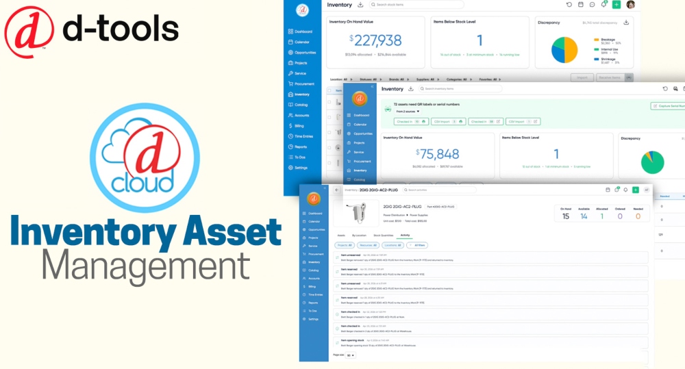
D-Tools Launches Inventory Asset Management for D-Tools Cloud
The update adds many new features and data points aimed introducing full asset lifecycle tracking into the D-Tools…
News June 11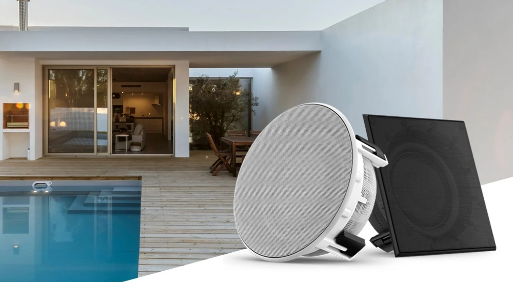
Garmin’s Thin Subwoofers Offer Sleek Sound in an Inconspicuous Package
The JL Audio Pavilion is an 8-inch subwoofer has been built with a shallow mounting depth able to…
News June 10
Bose Acquires StreamUnlimited as Company Expands Connected Audio Strategy
Bose has acquired StreamUnlimited, adding connected audio and streaming expertise as the company expands its smart home, premium…
News June 10
Meze Audio Unveils a New Set of High-End Headphones at HIGH END Vienna
The ARTA is a collaboration between Meze and Rinaro Isodynamics introducing the company’s highest-impedance driver to date with…
News June 9
CE Pro Podcast #174: Sonance CEO Ari Supran and How the Custom Integration Channel is Using AI
Sonance CEO Ari Supran discusses how integrators can use AI, agents and custom-built tools to boost efficiency, automate…
Podcast June 9Latest Products