Light is integral to how we experience space. With the right light our perception of the world around us changes drastically, and nowhere is this truer than with works of art. How you light art can be the difference between a moving experience or some lackluster wall clutter. And as integrators work with lighting more and more on projects, being able to properly light a client’s art collection can mean the difference between a harsh array of contrasts and living space that flows with color and vivacity.
What Types of Fixtures Should be Used to Light Art?
There is no one right answer to this question, but ideally, the space should allow for a lighting design using multiple layers of light to provide even illumination, contrast, drama and visual interest with the art in question.
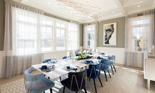
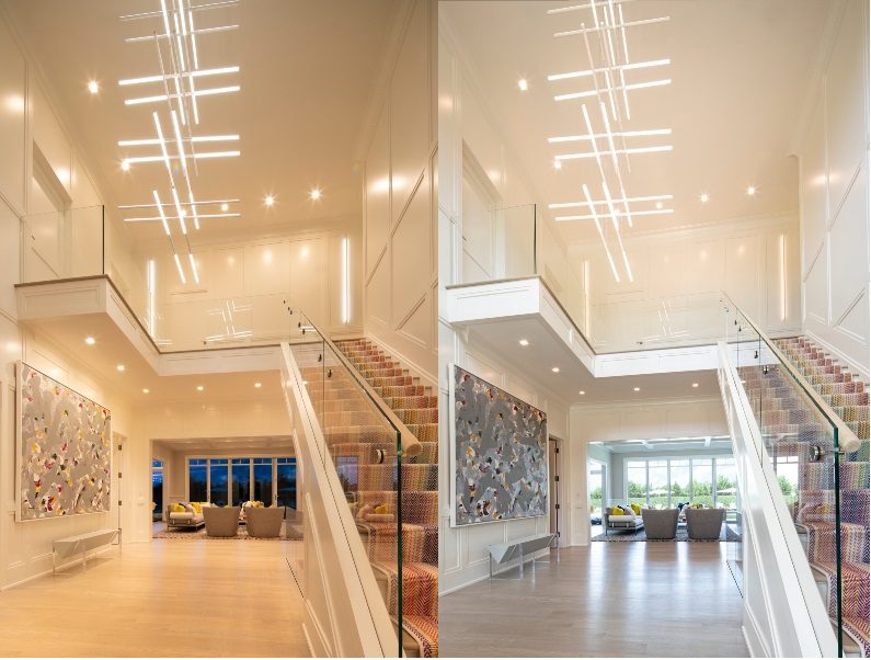
Recessed downlights are used to provide general ambient lighting and often serve as the main light fixture on most projects. In applications where art is intended to be displayed, downlights can be used to provide the fill light required for a space.
Wall Wash fixtures are used to create an even, vertical light wash effect on the walls. This can be critical to creating a space that is perceived as bright and welcoming. When strategically placed, wall wash fixtures can highlight selected vertical surfaces, including those hosting art, in a natural-looking, smooth, uniform way. This wall lighting effect is the preferred technique for modern art applications.
Adjustable light fixtures then work as the perfect highlights for object and areas of interest, like artwork. Because they are “adjustable”, you can aim the fixtures to objects you want to highlight with full tilt and rotation capability. Adjustable fixtures are also available for wide flood lighting, direct aiming, spotlighting, and cross-aiming.
How Should the Lighting be Layered?
Art of varying sizes and shapes may require a wide range of wall placements and light effects. And, to make things more challenging, the size and exact placement of the artwork is not always known before a lighting design must be settled upon. Therefore, flexibility is key when determining how light should be organized for art.
Downlight fixtures are typically spaced in regular pattern in a space so as to look the most integrated with the architecture. Depending on the fixture power and ceiling height, a 4’, 6’ or even 8’ spacing may provide enough light. This is where lighting calculations performed by a trained professional are helpful.
Wall wash fixtures should be placed in a one-to-one relationship, meaning the spacing offset from the wall should equal the fixture to fixture spacing. 2’ off the wall and 2’ on center is typically a safe wall wash solution, but a 3’ offset and 3’ fixture to fixture spacing can also work.
In the case of adjustable fixtures, they offer flexibility with the ability to tilt and aim toward specific pieces. A simple 30° tilt angle is often the ideal angle to light art pieces for the most vertical coverage with the least amount of shadow cast by the frame or other hardware. Mild rotation to create a light overlap with neighboring beams helps to create a smooth, even distribution of light.
How bright you want the light to be on the painting depends on the levels of the local surroundings. Contrast comes into play here. By nature, people are visually attracted to the brightest object in a space. If the goal is to draw attention to a much-loved or valuable piece of art, the natural tendency is to flood that piece with the highest light levels as compared with the neighboring areas.
How dimly or brightly to light an art piece can be largely a matter of preference, as well, but specifically regarding artwork, more is not necessarily better. The goal should be to create a balance where the art is lit slightly brighter than its surroundings without creating too harsh a glow.
How Does a Light’s Correlated Color Temperature (CCT) Affect Art?
White light is not just one hue but rather exists on a spectrum of warm to cool tones that are measured by their Correlated Color Temperature (CCT) in degrees Kelvin. Choosing color temperature, whether warmer or cooler, will determine how color is perceived.
The ‘ideal’ color temperature is based on personal preference and what whether you would like to emphasize warmth or make colors pop. Another line of thought regarding color temperature choice is to recreate the lit environment in which an art piece was created.
Following this approach, it might be desirable to light an old Dutch masters painting in warm, almost candlelit tones, such as 2500K, while a more modern abstract piece from the 1980’s may benefit from a cool 4000K, similar to the tones produced by linear fluorescent at the time. Impressionist pieces that were painted outdoors may benefit from a neutral, daylight-like 3500K. The right answer can vary from time period to time period, and from piece to piece.
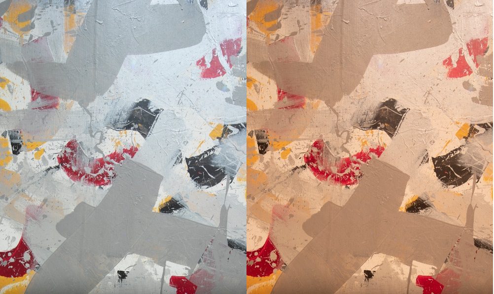
You can also look at it as how CCT changes the way color is perceived. This occurs as we move from one color temperature to another.
- Golden 2200–2400K: Dramatic and warm to deliver softened yellows, fire engine reds, plum purples, and mossy greens.
- Warm 2700K: The most popular choice for residential spaces, this soft tone similar to incandescent invokes sienna’s, burnt umbers, brown-black and rich reds.
- Neutral 3000K: An even-tempered light choice that fairly renders a wide range of shades, from Kelly green to deep purple, orange-yellows and fuchsia pink.
- Cool 4000K: Bright, white light delivers deep reds and vivid purples, vibrant blues and forest greens.
Color Rendering Index (CRI) is also important in making colors and finishes pop. A CRI greater than 90 is ideal, but 95+ will greatly enhance saturated tones in artwork.
Additional Considerations when Lighting Art
Versatility is always key. Artwork will come in varying sizes, shapes and placements, requiring a wide range of placements and lighting effects to get everything beautifully lit, so it’s important to have fixtures that can adapt and respond to those needs.
Small and medium pieces of artwork may be irregularly or unpredictably spaced, yet in permanent installations, regular light fixture spacing is usually desired – even though the objects shown within the space may be on rotation and be placed in a variety of locations. Adjustable fixtures offer the most versatility here, because you have the option of aiming directly at an adjacent piece, spotlighting, or cross-aiming for better coverage or to reach artwork located a little further away.
With large pieces of artwork, it can be a challenge to light an entire piece evenly. By using multiple adjustable fixtures with wide or linear spread beams, the fixtures can be aimed to ensure full coverage from side to side and top to bottom. Wall wash fixtures can also be used for broad coverage on a large piece.
Glass framing also adds to the complexity with distracting reflections that can interfere with direct viewing of art. If glass is necessary, it’s best to use glass with an anti-reflective (AR) coating to have the best viewing experience.
Additionally, these techniques work just as well lighting artistic pieces that may not strictly be considered artwork. A designer speaker, perhaps a digital art frame, all can be considered objects of interest on a project and can be lit using these same methods for greater emphasis.
Jennifer Concepcion is the Director of Product Management for USAI Lighting.


