Back in 2008, former Control4 CTO and co-founder Eric Smith described to me the future vision of the Control4 OS and what would someday become OS 3, even though OS 2 had yet to be released.
What he described was a dream of death to the “Circle of Power”—the circular formation of the Control4 user-interface—and a vision of a more powerful and universal UI with features that were easier and faster to use.
It seemed like a pipe dream, as OS 2 was just in final beta and didn’t resemble any of this. I was just finishing up reviewing OS 2 and no automation manufacturer at this time was looking into the crystal ball with these types of outlandish promises.
Fast-forward to a decade later. The founders have left, Control4 went public, and are now looking at being privately held again—and here we are, seeing Eric Smith’s vision playing out with exactly what was promised. The conversation I had with him a decade ago has become a reality with OS 3 today, and it has not failed to deliver.
Control4 OS 3 Interface Is Android
Before I dive into the look, feel, and user-friendliness of OS 3, I want to talk about the backend of the OS and what that means to dealers and end users.
The downside is that all controller products from the HC-250 and previous cannot be used with OS 3 and, while the HC-800 can be used, it cannot utilize the on-screen display (OSD) interface.
But before you throw your hands in the air declaring the sky is falling, keep in mind that the EA controllers have been out for over three years and it is time to update all those out-of-date systems anyway.
Enter (whatever iPhone or Windows OS comparison you want here).First, the new Control4 is powered by Android-based platform. The company has not moved entirely to Android; however, several core components of the operating system have been updated to improve performance and reliability. This means a much faster running and more responsive user experience with a streamlined interface. Upon initial testing, this showed a major drop in CPU and Memory usage—an obvious plus.
Related: Control4 Unveils New Smart Home OS 3 Platform
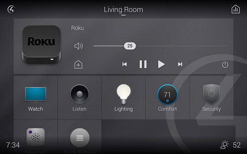
The immediate and most noticeable change a departure from the “Circle of Power.” Control4 has officially adopted the “grid” style that just about every consumer manufacturer has adopted from—from Roku to Apple TV and beyond.
The new home screen is the perfect blend of actionable navigation choices and “what’s on now” with complete simple navigation of now playing options. Included in the home is an entirely new operational Control4 icon, and a brand-new option on the top right called Media Sessions (which is my personal favorite new feature).
Media Sessions. OMG, Media Sessions
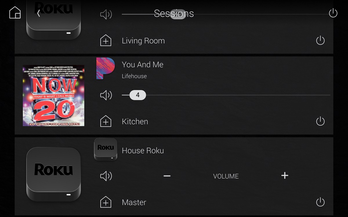
With the release of OS 3, one of the items that dealers and users have begged for improvement on has been control of “Zones.”
Zones has always been a source of contention, as while it was built for multi-room control, it has always been in the background and used only for audio. For OS 3, Zones has been completely crumpled up, thrown away, and replaced by Media Sessions.
This new method of multi-room control is quick and easy to access and now includes both video and audio. In a true multi-room environment with both Audio and Video matrixing, this long-asked-for feature is absolutely one of my favorite pieces of OS 3.
Easily accessed by the icon in the top right-hand corner, this feature gives a global overview of what is playing throughout the entire house, whether music or video. It also shows how many and which rooms are included in each session.
The obvious carryovers from OS 2 include independent room and session volume control and quick additions and subtractions of rooms on the fly.
Room Menu, Custom Buttons & Favorites
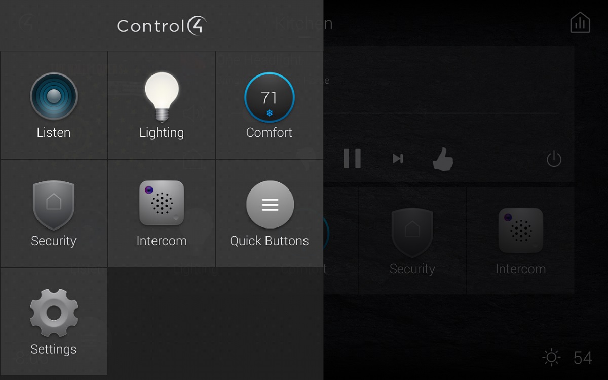
Let’s take a step back to the home screen that Control4 calls the room screen. There are a couple changes that I was on the fence about. The first notable is the room menu. Press the Control4 icon in the top left corner and a drawer slides out from the left to show the Control4 experience buttons like watch and listen and the other standard options.
This list included many of the same buttons that were on my room screen and I was left curious about the redundancy? Why have two locations on one screen to access the exact same things? I assumed that these are for the inexperienced user creating an “I’m lost button and need to start over.”
While this makes sense for the new or inexperienced this just didn’t make sense it my home. I then took a deeper dive into favoriting (see more below) and this has made all the difference. Now my room screen gives me access to only the things I use most, and the room menu gives me access to things that I access infrequently. Very cool!
The next big change, and at some point, led to a small sense of frustration has been the move of “Custom Buttons.” While we all have used these in the past as “place holders” on the corners of a room’s main page these have now been moved to an icon within navigation.
This does make sense with the move to a grid style UI, upon initial update it led to some confusion — “Where did my quick keys go?”
While on the subject of Home Screens, back by popular demand are Favorites, but so much better this time around! That is right, the ability to create short cuts directly to a user’s most used but buried in navigation function is back.
For those who do not remember Favorites, which we lost in mid OS 2.X, allowed short cuts to be made to items like a specific camera view or a surround sound receiver’s sound settings to be brought to the front of navigation for quick access and to be jumped to directly through programming. This functionality was a user and programmer “favorite” feature when it was previously available.
But new brand new favorites is so much better because the homeowner can make all the changes on their own from within the UI.
Read Next: Control4, SnapAV CEO Interviews—Analyzing the Home Automation Merger
Press and hold just about anything available in a room (albums, artists, playlists, station, camera, lock, light, scene) and that item is now on the room screen for that room. Want to delete an item on the room screen, press and hold that item and you delete or rearrange items on the room screen.
Customers are going to freak, in a good way!
Before I dive into the Composer side of things, I will note this complete change in UI and interaction is an amazing step forward.
Included are easier methods to deal with Wallpapers and Screensavers, the ability to create a “Virtual Home Status Room” which is so interesting I will be doing an entirely separate blog on it, and many other UI features that would require me to write a book on to cover everything I have found and used.
From that conversation with Eric Smith in 2008 to now, I am happy to say the wait is over for one of the best UI’s for home control I have ever used.
Composer Software Update
And now it’s time to talk about what’s new and improved in Control4 Composer Pro Software. There are two huge items that will jump right out at you when you do your first update and are things I have personally wanted forever. The first is the “Composer Pro Auto Update.”
When you first open Composer Pro, it will check online to see if you are running the most current version and then will prompt you to update. This is a big deal moving forward as it will ensure you are always on the most recent maintenance version and will be a “quiet” reminder to keep systems up-to-date.
The next huge improvement is the pre-update system verification, which Control4 is calling the “Update Advisor.”
It automatically runs whenever you connect to a system and Composer Pro then gives you a complete report of all devices that need updating or are no longer compatible with the system (like older HC controllers).
It also gives you an entire list of drivers that need to be updated and/or removed prior to updating. Many of us remember the pain in going from a OS 1.X version to a OS 2.X and how painful that was due to driver issues we all had to resolve and figure out on our own.
This new Upgrade Advisor is genius! It streamlines the entire approach and allows this major update to be completed in minutes.
On that note, to date I have tested all common third-party drivers from companies like Chowmain Software, Blackwire Designs, Annex4 and others for compatibility and usage and so far, I am able to report zero outstanding issues.
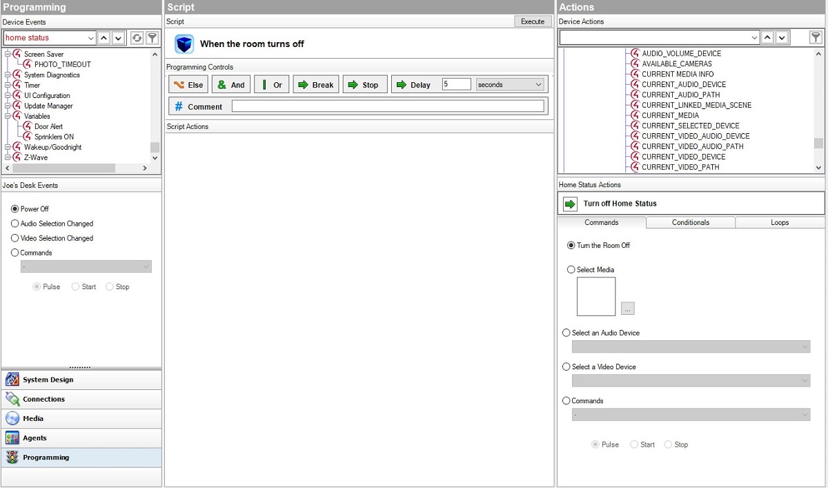
There is an OMG moment in OS 3 Composer Pro. Programming with Else, And, Or, Break, Stop, and Delay is here and on the very top of your programming window as well as the ability to add notes in programming.
This is a complete feature set that Control4 installers have asked for since the beginning. This in itself is a big reason to move to OS 3 – it breaks from the norm within Composer and a step towards the advanced “evaluation” style programming we have all requested. You asked, Control4 delivered.

device or button summary of all programming.
The next big addition is “Programming Summary.” This is a per room, device, or per button summary of all programming associated with a selection in System Design.
This one is a big time saver on a system with major customization. We have all had the headache of running the programming report and combing through pages of programming to find “that one thing.” Those days are gone.
Want to know what all programming is associated with a button on a keypad? Scroll to it in System Design, click on it, then click on Summary. Done. Want to know all programming associated with the Theater? Do the same thing.
This easy drill-down will not only save you time, but it will also let you scroll through active programming without the fear of accidentally moving or deleting something. Yes, I have done this myself.
Custom Wallpaper Easier
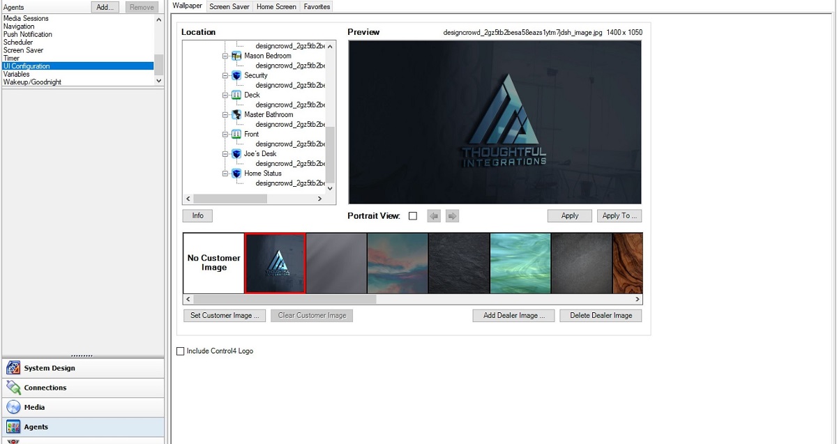
The last Composer item I want to note is the big change in Wallpaper. While not including the Control4 logo on the UI has been around for a sec, creating and making custom Wallpaper for a client has not always been the easiest task.
In OS 3, Composer Pro adding custom wallpaper is a snap. Simply go into the UI Configuration agent, click “Add Dealer Image” pic the photo from your PC, and load it. It will auto format for both landscape and portrait (in which you can preview both) and implement to whichever UI’s you choose.
This timesaving agent addition will take what has not always been the easiest task and cut it down to seconds in implementation. This common user ask can now be accomplished in seconds without photo editing or resizing.
This same agent also gives the power to set all screensavers and push favorites to each room in the house – another big time saver!
Related: Smart Home Deep Dive—Profiling a Typical Smart Home Installation
To sum it all up, I have dreamt of this type of UI, programming, and ease-of-use since my chat with Eric Smith back in 2008.
Not only were these thoughts and promised delivered, they were delivered at a time when Control4 and Control4 Dealers needed them the most.
In a world of quickly changing user interfaces, consumer demands, home technology giants, and simplification of use, Control4’s OS 3 does not disappoint. Control4 has achieved their best OS yet, and in many cases, OS 3 is the best OS on today’s market.
